MacKenzie-Childs
Copywriting · Campaign Development · Product Storytelling
Writing for MacKenzie-Childs meant working inside a brand world with no shortage of personality. From expanding the iconic Check line and launching new product categories to seasonal campaigns, collectible releases, and evergreen brand storytelling, I developed copy and creative concepts that gave each story its own point of view while keeping the larger brand unmistakably intact.
Campaign Launches
Launching a product started with finding the right story to tell.
From expanding an iconic pattern family to introducing entirely new product categories and collectible programs, I helped develop the positioning, campaign language, and customer-facing stories that carried each launch across channels.
Making neutral feel unmistakably MacKenzie-Childs.
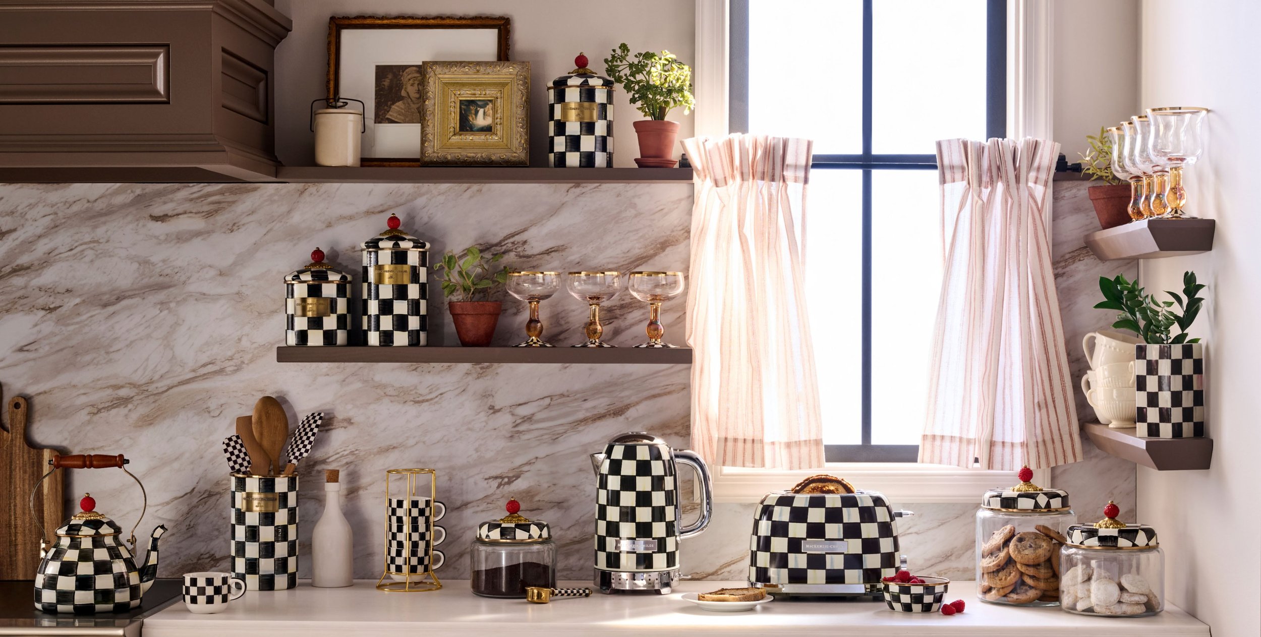
Mocha Check expanded the brand's iconic Check family with a softer, grounding palette. The challenge was giving a neutral enough personality to earn its place inside a famously expressive brand world.
I developed language around natural materials, everyday rituals, warm interiors, and effortless layering, creating a point of view that felt calm without ever feeling quiet.
Introduce a new neutral without making it feel generic, overly restrained, or disconnected from the larger brand.
A grounding, versatile Check inspired by natural materials, everyday rituals, and warm, layered interiors.

Launch Positioning
A neutral with a point of view.
The foundational launch language introduced Mocha Check through the warmth of flax, linen, honey brown, and sunlit yellow, positioning the collection as a softer expression of the MacKenzie-Childs aesthetic rather than a departure from it.

Cultural Moment · Pantone
A cultural moment, in real time.
When Pantone named Mocha Mousse its 2025 Color of the Year, Mocha Check suddenly had a place inside one of the year’s biggest color conversations. Rather than simply reference the coincidence, we built it into the launch, using the unexpected alignment to tease the collection, build curiosity, and make the eventual reveal feel remarkably of-the-moment.

01 · Tease
Turn the cultural moment into curiosity.
Published Social Caption
Something is brewing... ☕️ Can you guess what’s coming next to #MacKenzieChilds? Drop your best bet in the comments! 👀
02 · Hint
Give them a taste.
Published Social Caption
Just a taste of the perfect blend coming your way… ☕️ #MacKenzieChilds

03 · Reveal
Make the connection official.
Published Social Caption
Introducing our newest collection, Mocha Check! ☕ A fresh take on a classic pattern, inspired by natural materials and everyday rituals. Shop now through the link in bio 🤎
Turn an unexpected cultural alignment into launch momentum, connecting Mocha Check to a larger conversation about neutrals as comfort, the beige revival, and homes as sanctuaries.
Merchandising
From launch story to living collection.
As the campaign evolved, the language moved from introducing Mocha Check to demonstrating its versatility. Layering, cross-pattern styling, and familiar brand favorites helped position the collection as something customers could build around rather than buy into once.


Emerald Check
A new shade enters the Check family
Green as a canvas, not an accent.
Emerald Check introduced a saturated new hue into one of MacKenzie-Childs' most recognizable pattern families. The challenge wasn't making the color feel bold. It was reimagining what a signature color could be and expanding the idea of what could function as a neutral.
I helped shape a campaign world that balanced the brand's jewel-toned richness with botanical references, natural textures, and a playful Palm Springs sensibility, positioning Emerald not as a seasonal accent, but as a vivid canvas for everyday styling.

Iconic plating in a brilliant new color.
Building the World
Rich color,
with the windows open.
Instead of leaning into emerald green's more traditional associations, the launch opened the color up. Tropical foliage, wicker, warm gold, and flashes of resort pink brought a lighter, more relaxed energy to the collection while preserving the richness customers expected from MacKenzie-Childs.


Reimagining the definition of neutral.
Rather than treating Emerald as a one-note statement or a holiday-leaning accent, the launch positioned it as something more expansive. Green is everywhere: in gardens, palms, produce, landscapes, and interiors. Why not let it function as a foundation for home décor and dining?
Styled among florals, natural textures, and collected tabletop details, Emerald Check offered a fresh way to think about signature style: expressive, grounded, and surprisingly livable.

Made slowly.
Gone quickly.
The inaugural Collectors Series turned hand-painted craftsmanship into a monthly product event. Each mug required significantly more hands-on production than a standard piece, making the collection both more expensive and naturally limited in quantity.
With small batches released once a month, owning every design was never really the point, or even a realistic expectation. The campaign needed to celebrate what made each mug worth watching for: the work behind it, the personality of each release, and the little thrill of getting your hands on one while you could.
The Craft
Finding value
in the making.
The higher price point made the production story essential. Rather than asking customers to take "hand-painted" at face value, behind-the-scenes content showed the brushwork, process, and human effort behind every mug, making the craftsmanship, and its value, something customers could actually see.
The Drop
One mug. Once a month. While it lasts.
The monthly cadence gave each mug its own moment, but quantities were intentionally limited. The campaign leaned into that unpredictability instead of suggesting customers needed to complete a set. Each release became its own opportunity to discover something distinctive, decide whether it was your mug, and act before it disappeared.


